
Tu GestorInformático
Menu
Back to work

Online store

Me Lo Merezco Contigo

Fashion for real women

A fashion brand speaking to real women needed a store that conveyed exactly that: warmth, real bodies, and enough trust to buy clothes you cannot try on first.

Client
Me Lo Merezco Contigo
Type
Online store
Platform
WordPress + WooCommerce
Year
2026
Visit the site
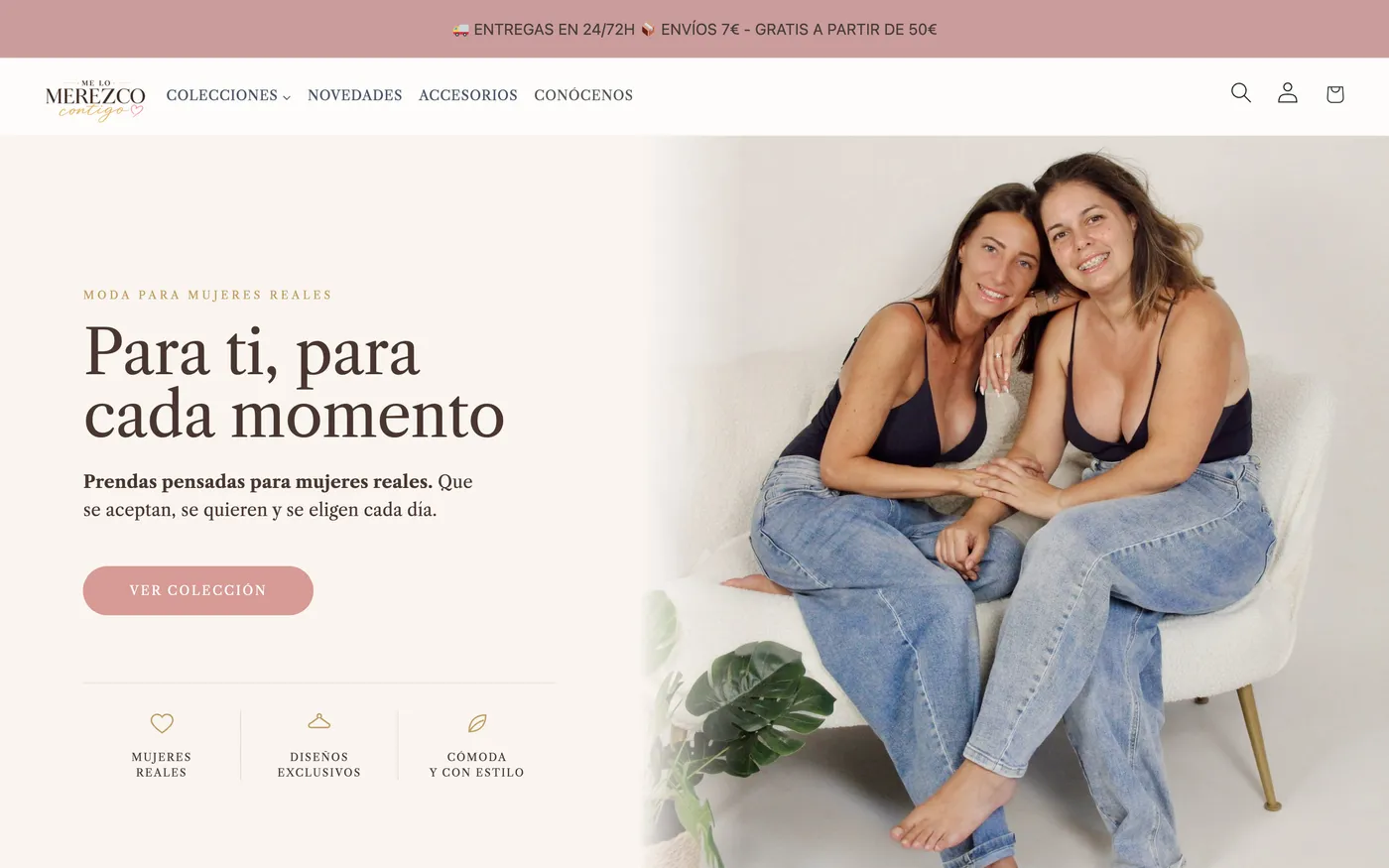
The Me Lo Merezco Contigo storefront on desktop: collections menu, the headline “Para ti, para cada momento”, and a photograph of the founders as the lead image.

The project

Where it started

Me Lo Merezco Contigo launched with a sharply defined idea: clothes made for women who accept and choose themselves every day. The challenge was not aesthetic, it was trust. Selling clothing online means asking someone to commit to a size unseen, and for a brand built on real bodies that gets more delicate still: if a customer cannot see herself represented, she does not buy.
What we decided

That the store had to look like its customers rather than a generic fashion catalogue. Real photography leading, no illustrations and no impossible bodies. A warm, direct tone in every piece of text — including error messages and order emails. And navigation designed from the phone up, because that is where nearly all fashion traffic happens.

What we built

We structured the catalogue around collections and occasions rather than cold product categories. Product pages answer the doubts that stall a purchase before they surface: how the garment falls, which size to pick, how long delivery takes, and what happens if it is wrong. Shipping and returns notices sit where the decision gets made, not buried in the footer.

Where it is today

The store is live and trading, and the Me Lo Merezco team runs its own catalogue: they add products, swap collections and adjust prices without needing us for anything day to day. We still handle technical support and occasional improvements, which is exactly the relationship we were aiming for.

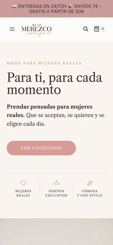
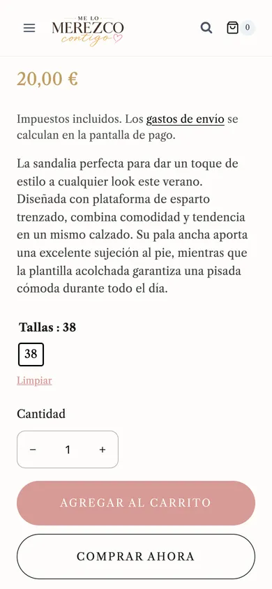
The same storefront on a phone: compact menu, headline, brand copy and a “Ver colección” button stacked in a single column.A product page on mobile: price with tax included, a shipping-cost note, the garment description, size selector, quantity, and add-to-basket and buy-now buttons.

Three decisions that shaped the project

  • Mobile first, genuinely

    Not a mobile version bolted on at the end. The design started at phone width and expanded outward to desktop.

  • Doubts answered before they are asked

    Sizing, drape, delivery windows and returns visible at the moment of deciding. Every unanswered doubt is an abandoned basket.

  • Client autonomy

    Training and documentation so the team runs its own catalogue. Our goal is not to be needed for every change.

No inflated metrics

We could fill this space with a “+40% conversion” that reads well and means nothing. We would rather not. If you want to talk concrete results, we will put you in touch with the client.

Have a store in mind?

If you sell online, or want to, tell us about it. We will say frankly whether you want a custom store, a platform like Shopify, or neither of them just yet.